If you desire to build high-quality applications, you need to spend some time prioritizing and optimizing the components that you build for accessibility to everyone. This means considering how your app is able to be used by people with various cognitive, physical, auditory, verbal, visual, and neurological abilities.
This article serves as a guide for you to learn the strategies for building inclusive applications using Vue.js. In the end, you will have acquired knowledge on how to utilize the framework’s strengths to build high-quality applications that everyone can use.
Introduction to Accessibility in Vue.js
Accessibility describes how usable a website is for all kinds of people. When an application is referred to as accessible (shortened to “a11y”), it means that anybody from any background can seamlessly operate the application and have an enjoyable experience. To achieve this, you need to not only focus on improving the performance of the application, but also spend time building it in a way that it is perceivable, operable, understandable, and robust (POUR). Those are the four core principles of the Web Content Accessibility Guidelines (WCAG).
Optimizing an application for accessibility aims to minimize the number of people who are unable to use it. Thus, the need for accessibility cannot be over-emphasized since not everyone uses the web the same way.
Accessibility Checklist for a Vue.js Application
Vue.js comes with its own set of accessibility issues particular to single-page applications.
For example, in a traditional web app, when a user navigates to a page or makes an asynchronous request, the entire page is refreshed. This refresh also redirects the keyboard or screen reader focus to the top of the page.
However, in single-page apps, data is dynamically updated without a page refresh. By default, this means that the focus remains on the button or link that was activated. As a result, users who cannot see the page are not notified of the change.
But these issues can be rightly tackled and remedied.
Let’s take a look at an ideal checklist that can serve as a starting point for transforming your application into an inclusive one. This will enable you to create accessible Vue.js applications more easily.
So we’ll be covering:
- Improve Keyboard Accessibility
- Facilitate Focus Management
- Setup Accessible Routing and a Page Title for Each Page
- Write Semantic HTML from the Beginning
- Buttons vs Links
- Give Descriptive Names to Images
- Closed Captions for Videos
- Ensure Optimized Contrast
- Use Descriptive Hyperlinks
- Convey Change of State
- Specify the Language for Each Document
- Implement Accessible Animations
- Consider Light and Dark Modes
Improve Keyboard Accessibility With tabindex Attribute
Keyboard navigation is an essential aspect of accessibility, as it makes it possible for people using screen readers or other assistive technologies to intuitively interact with a webpage, via tab order. Thus, tab order must follow an intuitive and predictable sequence aligned with the flow of content on a web page. This is where tabindex comes in.
The tabindex attribute is used for making HTML elements focusable or sequentially unfocusable when using the TAB key of a keyboard for navigation.
To include an element that is not focusable by default (e.g. <div>, <span>) in the tab order, we can use tabindex="0". Use tabindex="-1" to remove an element from the tab order, such as hidden elements or decorative images.
<template>
  <!--     Buttons are focusable by default but with tabindex set to -1, the button is no longer focusable -->
  <button tabindex="-1">Unfocusable button</button>
</template>
Facilitate Focus Management
Focus management involves determining how to display a currently active or highlighted item to users when the mouse is not in use. It also ensures that changes in focus are predictable.
Here are some tips on facilitating focus management:
- When it comes to forms, ensure you set the first field in any form to autofocus, then programmatically set focus to the field that follows by calling the
.focus()method on it. This way, users don’t have to make use of their mouse while filling out a form.
<template>
  <form class="form">
    <div class="form-control">
      <label for="email">Email</label>
      <input
        autofocus
        type="email"
        name="email"
        id="email"
        @keypress.enter="setFocusOnSecondInputField"
      />
    </div>
    <div class="form-control">
      <label for="password">Password</label>
      <input ref="inputTwo" type="password" name="password" id="password" />
    </div>
  </form>
</template>

<script lang="ts" setup>
// Referring to the second input field element in the template
const inputTwo = ref<HTMLElement | null>(null);

// Function to set focus to the second input field when the enter key is pressed
const setFocusOnSecondInputField = () => inputTwo.value?.focus();
</script>
- Some elements are naturally focusable, by default (when using the
TABkey on a keyboard), otherwise, withtabindex="0", any element can be placed into the tab order.
<template>
  <div tabindex="0" @click="doSomething" class="card">
    This is clickable card component, with tabindex set to 0, so that it can be
    focusable
  </div>
</template>
- With the
refattribute, you can refer to an element in the template of a component. For example, assuming the desire is to shift focus to a capture button when a page is mounted:
<template>
	<div class="button-container">
		<button ref="captureButton">Capture</button>
	</div>
</template>

<script setup lang="ts">
import { onMounted, ref } from "vue";

const captureButton = ref<HTMLElement | null>(null);
const focusOnCaptureButton = () => {
	captureButton.value?.focus();
};

onMounted(() => focusOnCaptureButton());
</script>

<style>
.button-container {
	display: flex;
	align-items: center;
	justify-content: center;
	height: 300px;
	background-color: white;
}
</style>
In the code snippet above, when the page is mounted, the .focus() method is called on the capture button, and it receives focus. This demonstrates how focus can be programmatically set on an element.
Setup Accessible Routing and a Page Title for Each Page
By default, a Single Page Application (SPA) consists of just one page, hence the name. However, it is important to ensure that users who interact with your app in a non-visual way are kept informed when the browser’s location is modified since route changes may not be obvious to them.
The way to announce to our users that they’ve entered a new page is as follows:
- On every main page of your app, you should set up a skip link. This link should be the first accessible link for screen readers.
Ideally, browsers read web pages from top to bottom. However, it is common to have a navigation bar at the top of web pages. The issue arises for screen reader users, as the navigation is read out as a list of links, which can be time-consuming.
To assist screen reader users in bypassing the navigation and accessing the main content, a skip link should be included at the top of the page. However, this skip link should be visually hidden from users who do not use/need screen readers.
<template>
	<a href="#" class="skip-link" ref="skipLink">Skip to main content</a>
	<h1>Contact Page</h1>
</template>

<style>
.skip-link {
	white-space: nowrap;
	margin: 1em auto;
	top: 0;
	position: fixed;
	left: 50%;
	margin-left: -72px;
	opacity: 0;
}

.skip-link:focus {
	opacity: 1;
	background-color: white;
	padding: 0.5em;
	border: 1px solid black;
}
</style>
- Using a
watch, programmatically shift focus to the skip link whenever a user changes routes, by calling focus on the template ref for the skip link. Also using thewatch, make sure to update the title of the new web page.
<script lang="ts" setup>
import { ref, watch } from "vue";
import { useRoute } from "vue-router";

const route = useRoute();

const skipLink = ref<HTMLElement | null>(null);

watch(
	() => route.path,
	() => {
		document.title = "Contact";
		skipLink.value?.focus();
	},
	{ immediate: true }
);
</script>
-
Set up a
visually-hiddencontainer that serves as an announcer of a list of possible announcements for assistive technology users. Make sure the skip link references this container.Next, use the
aria-liveattribute to announce that navigation to a new page has occurred.In this demo below, the
infoToReadarray serves as a list of announcements, and when the Contact page is mounted, the info"You are now on the contact page"is populated as an announcement to be made.
<template>
	<a href="#navigation-info" ref="skipLink" class="skip-link"
	>Skip to main content</a>
	<ul id="navigation-info" class="visually-hidden" :aria-live="ariaLive">
		<li v-for="(info, index) in infoToRead" :key="index">{{ info }}</li>
	</ul>
	<h1>Contact Page</h1>
</template>

<script lang="ts" setup>
import { ref, onMounted } from "vue";

const ariaLive = ref<"off" | "assertive" | "polite">("assertive");
const infoToRead = ref<string[]>([]);
const speak = (info: string) => {
	if (info) {
		infoToRead.value.push(info);
	}
};

onMounted(() => speak("You are now on the contact page"));

// ... other scripts
</script>

<style>
.visually-hidden {
	position: absolute;
	margin: -1px;
	border: 0;
	padding: 0;
	width: 1px;
	height: 1px;
	overflow: hidden;
	clip: rect(0 0 0 0);
}

// ... other styles
</style>
The
aria-liveattribute transforms an element into a notification container. It sets the priority for how screen readers should treat updates to a live region on a non-interactive document.
Finally, you should have code that looks like so:
<template>
	<a href="#navigation-info" ref="skipLink" class="skip-link"
	>Skip to main content</a>
	<ul id="navigation-info" class="visually-hidden" :aria-live="ariaLive">
		<li v-for="(info, index) in infoToRead" :key="index">{{ info }}</li>
	</ul>
	<h1>Contact Page</h1>
</template>

<script lang="ts" setup>
import { ref, onMounted, watch } from "vue";
import { useRoute } from "vue-router";

const route = useRoute();
const ariaLive = ref<"off" | "assertive" | "polite">("assertive");
const infoToRead = ref<string[]>([]);
const speak = (info: string) => {
	if (info) {
		infoToRead.value.push(info);
	}
};
const skipLink = ref<HTMLElement | null>(null);

watch(
	() => route.path,
	() => {
		document.title = "Contact";
		skipLink.value?.focus();
	},
	{ immediate: true }
);

onMounted(() => speak("You are now on contact page"));
</script>

<style>
.visually-hidden {
	position: absolute;
	margin: -1px;
	border: 0;
	padding: 0;
	width: 1px;
	height: 1px;
	overflow: hidden;
	clip: rect(0 0 0 0);
}

.skip-link {
	white-space: nowrap;
	margin: 1em auto;
	top: 0;
	position: fixed;
	left: 50%;
	margin-left: -72px;
	opacity: 0;
}

.skip-link:focus {
	opacity: 1;
	background-color: white;
	padding: 0.5em;
	border: 1px solid black;
}
</style>
One of the strategies employed here was to give the announcing div a class of visually-hidden, to visually hide the element without removing it from the DOM and accessibility tree. This ensures that the content remains accessible to assistive technologies such as screen readers.
Also, the title of the HTML document should be set to convey the purpose of the page (for example, “Contact Page” as seen in our code above) when the user enters the page, otherwise, the generic name for the application would be displayed as the document title.
Write Semantic HTML from the Beginning
At the foundation of every accessible application is semantic markup.
Whenever possible, make use of semantic HTML. Automatically, native elements have rich semantics, while generic elements like span's and div's have generic semantics.
For example, if you need to create a custom button, be sure to use the native button tag rather than a div or span. By doing this, you take advantage of the accessibility benefits provided by the button tag.
However, if there is no native element for the use case, the WAI-ARIA Specification can come in handy to improve the semantic meaning of the element on the DOM.
Let’s now look at various ways to build semantically correct components.
- Accessible headings: Headings are used to organize content and make it easy to navigate. Assistive technologies rely on the appropriate rendering of headings to traverse the accessibility tree in an orderly way rather than traversing node by node through the DOM. Hence, it is essential to use headings in order of hierarchy:
<h1>-<h6>, include a heading text within a section, and make use of heading tags where needed, rather than styling a text to appear like one.
For example, the hierarchical structure for headings of a documentary article webpage would look like:
h1 = title of the documentary article
    h2 = subheading in the content of the documentary article
        h3 = subheading under the h2 content
            h4 = subheading under the h3 content
    h2 = subheading in the content of the documentary article
    h2 = associated news (displayed in the aside section)
    h2 = contact us (displayed in the footer)
        h3 = address (the address information of the webpage)
        h3 = socials (social media links of the webpage)
- Make use of landmarks for easy navigation: Landmarks serve as a means of navigation through an HTML document for non-visual users who rely on assistive technology. By default, HTML sectioning elements such as
main,nav, andasidedefine various ARIA landmarks. Therefore, if sectioning elements are used without a proper understanding of their purpose, users of assistive technologies may become confused when interacting with your application.
| HTML element | Landmark role |
|---|---|
| <header> | Title of the web page |
| <main> | The main content of a web page |
| <aside> | Complements the main content, while being meaningful on its own |
| <form> | Describe a collection of form-related elements |
| <nav> | Navigation on a web page |
| <footer> | Content information about a document |
| <section> | Region on the document with high relevance |
    // Using landmarks and proper headings
    <template>
    	<main role="main" aria-labelledby="main-title">
    		<h1 id="main-title">The Main Title</h1>
    		<section role="region" aria-labelledby="section-title-1">
    			<h2 id="section-title-1">The Section Title</h2>
    			<h3>The Section Subtitle</h3>
    		</section>
    	</main>
    </template>
-
Accessible forms: Building an accessible form involves using related semantic form elements such as
<form>,<label>,<button>,<textarea>,<input>,<fieldset>. An accessible form is more than just displaying input tags for which users can input related information. Binding theidof the input tag to theforattribute of thelabelis crucial for improving the accessibility of the form. This ensures that the input fields are associated with their corresponding labels, providing a clear purpose for each input field throughout the form.<label for="class">Class:</label> <input type="text" name="class" id="class" v-model="class" /> -
Build semantic tables: Data tables need to be built properly so that they are accessible. This way, someone using a screen reader can seamlessly scan through the table with the right navigation. This can be achieved by the following:
- All table data should be wrapped with the
<table>element. - The
<summary>element should provide a summary of a table’s instance. - When using the
thelement, ensure that thescopeattribute is in place. This helps assistive technologies detect if the table header is for the column or row of a cell.
- All table data should be wrapped with the
Buttons vs Links
Ideally, links should not be buttons, and buttons should not be links.
If the interaction leads to a change in state but not a location change, use a button. On the other hand, if you are referring to a piece of content that has its URL, use a link.
An icon button can be made accessible to screen reader and keyboard users by making use of the aria attribute, like so:
<template>
	<button>
		<i class="icon icon-star" aria-hidden="true"></i>
		<span class="visually-hidden">Star</span>
	</button>
</template>

<style>
.visually-hidden {
	clip: rect(0 0 0 0);
	clip-path: inset(50%);
	height: 1px;
	overflow: hidden;
	position: absolute;
	white-space: nowrap;
	width: 1px;
}
</style>
Here, the value of true for the aria-hidden attribute sets the icon to be hidden when used by screen readers, while the visually-hidden class makes the text appear rendered to a screen reader while it’s visually hidden from view.
This way a visually impaired user can identify the button.
If you need to create a button using the div tag, set the role attribute of the div to button and assign a tabindex of 0. This ensures that a keyboard or screen reader can access the div (now acting as a button).
It’s also important to make sure that button events are accessible by keyboard and screenreader users, no matter the kind of event that is triggered by adding key modifiers like for v-on or @, for example, @keyup.page-down="onPageDown"
Give Descriptive Names to Images
Always describe the appearance of an image in a way that is thoroughly descriptive. Instead of:
<img src="image.png" alt="people holding a flag"/>
It can be more descriptive, like so:
<img src="image.jpg" alt="two men holding the Nigerian flag"/>
This also applies to SVGs. By giving value to the aria-label attribute:
<template>
	// aria-label
	<svg aria-label="Uche Azubuko's SVG"></svg>

	// aria-labelledby => exposes the title as its accessible name
	<svg aria-labelledby="svg-title">
		<title id="svg-title">Uche Azubuko's SVG</title>
	</svg>
</template>
When it comes to images that are used solely for decorative purposes, it is acceptable to use an empty alt text. However, it is important to include the alt attribute and not omit it entirely.
Closed Captions for Videos
When working with videos within your application, make sure that all your videos have accurate captions. This can be implemented using the <track> element.
With the <track> element, you can specify a text file that contains the subtitle information, along with the language it is in.
For example:
<template>
	<video id="video" controls preload="metadata">
		<source src="video/UA-films.mp4" type="video/mp4" />
		<source src="video/UA-films.webm" type="video/webm" />
		<track
			label="English"
			kind="subtitles"
			srclang="en"
			src="captions/vtt/UA-films-en.vtt"
			default />
		<track
			label="Español"
			kind="subtitles"
			srclang="es"
			src="captions/vtt/UA-films-es.vtt" />
	</video>
</template>
Ensure Optimized Contrast
Ensure that the colors used in your application have optimal contrast. The contrast between the colors of any text and its associated background must be distinct— meeting minimum ratio levels to ensure legibility and make content readable for visually impaired users.
WebAIM Color Contrast is a helpful tool in achieving this.
Let’s have a look at how to ensure color accessibility using WebAIM’s color contrast checker.
First, head over to https://webaim.org/resources/contrastchecker/.
Next, enter the colors for the foreground and background of your content, or choose any color using the color picker. The lightness slider can be used to lighten or darken a color.
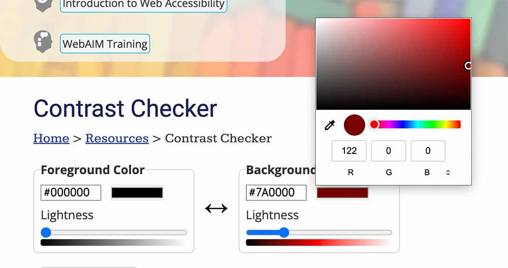
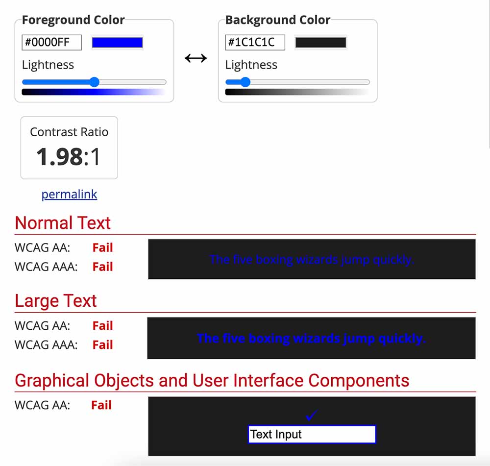
After the foreground and background colors have been entered, the checker will display the contrast ratio of the inputted colors, and a pass or fail indicator when used for normal or large texts and graphical or user interface components like buttons or form fields.
- This is a sample report for a contrast ratio that is not accessible.
- This is a sample report for a contrast ratio that is highly accessible.
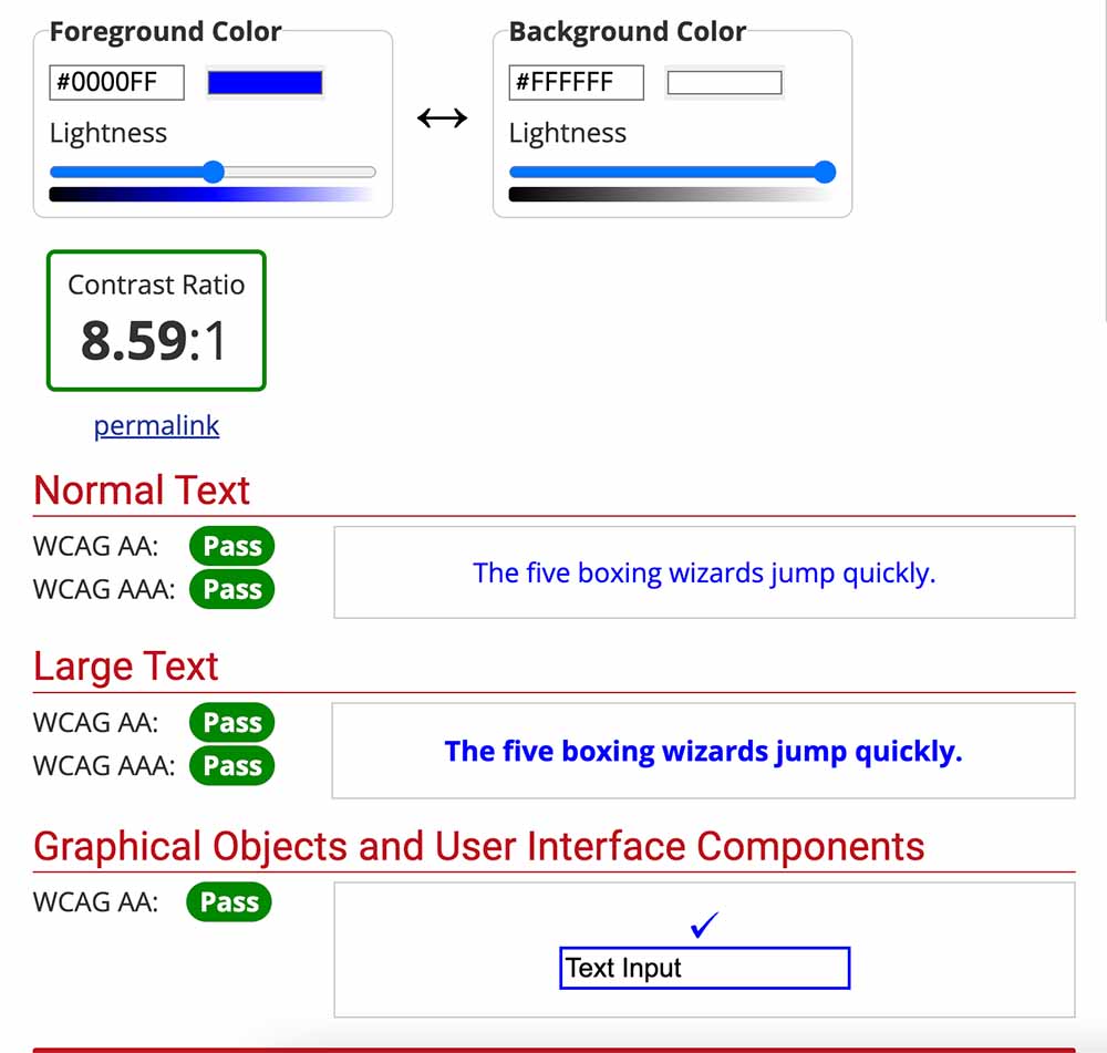
This provides a straightforward way to be sure that the colors used in your applications are compliant with WCAG 2.0, WCAG 2.1, and WCAG 2.2. guidelines.
WCAG (stands for Web Content Accessibility Guidelines) explain how to improve the accessibility of web content for people with disability.
Use Descriptive Hyperlinks
Ensure that you use descriptive hyperlinks in your application, instead of just the URL. Since screen readers announce the presence of a link to non-visual users, a descriptive link is necessary and important as it helps to provide a proper context of where a link will take them when clicked.
So, instead of doing this:
<a href="https://github.com/ucheazubuko">Click here</a>
Implement it this way instead:
<a href="https://github.com/ucheazubuko">Learn more about Uche Azubuko</a>
Convey Change of State
Make it a habit to use aria-live regions to programmatically expose dynamic changes to the content of a page so that they can be announced by the assistive technology in use.
This is similar to using a toast to inform visual users when parts of a page change without requiring the entire page to load. For instance: an alert for incoming messages.
The code snippet below illustrates how a toast notification can be built for assistive technology users using the aria-live attribute. When the showToast function gets called, the information about the toast is announced to the user, while the toast container itself is visually hidden.
<template>
  <ul class="visually-hidden" :aria-live="ariaLive">
    <li v-for="(toastInfo, index) in toasts" :key="index">
      {{ toastInfo }}
    </li>
  </ul>
</template>

<script setup lang="ts">
import { ref } from "vue";

type ToastDetail = {
  id?: string;
  title: string;
  description: string;
  type: "error" | "success" | "";
  duration: number;
};

const ariaLive = ref<"off" | "assertive" | "polite">("polite");

const toasts = ref<ToastDetail[]>([]);

const showToast = (toastInfo: ToastDetail) => {
  // Your business logic for displaying toast here
  toasts.value.push({
    ...toastInfo,
    id: (Date.now() + Math.random()).toString(36),
  });
};
</script>

<style>
.visually-hidden {
  position: absolute;
  margin: -1px;
  border: 0;
  padding: 0;
  width: 1px;
  height: 1px;
  overflow: hidden;
  clip: rect(0 0 0 0);
}
</style>
Specify the Language for Each Document
Declaring the language used on your website is important for screen readers to accurately interpret the content, especially for multi-language websites. This can be done by setting the lang attribute at the document level of the application, as shown below:
<html lang="es">...</html>
Specifying the appropriate language can also be done at the component level, especially if the components have different languages. By setting the correct language on your website, you prevent a screen reader from using its default language when identifying text content.
Implement Accessible Animations
Animations in your application can be made accessible by listening for the “reduced motion” preference in your user’s system. This allows for more control over the interfaces within an app.
By using the prefers-reduced-motion feature, you can configure the application’s animations to respect the user’s preference for reduced motion.
Here’s a sample code showing how to achieve this:
/* Remove all animations, transitions, and smooth scroll for people that prefer not to see them */
@media (prefers-reduced-motion: reduce), (update: slow) {
	html*:focus-within* {
		scroll-behavior: auto;
	}

	*,
	**::before*,
	**::after* {
		animation-duration: 0.01ms !important;
		animation-iteration-count: 1 !important;
		transition-duration: 0.01ms !important;
		scroll-behavior: auto !important;
	}
}
Also, making animations optional by creating toggles for switching the presence of animations can come in handy, as shown in this demo by Una Kravets, using a simple “reduce animation” switch. Another example is the Animal Crossing website which has a toggle button on the header to enable or disable motion.
Consider Light and Dark Modes
Rather than limiting your users to just one style, it can be helpful to let them toggle between themes. This serves as a great way for them to customize the app to their need.
A simple theme switcher looks like this:
<template>
	<form class="theme-switcher">
		<label for="theme-switcher">Theme Switcher</label>
		<input type="checkbox" id="theme-switcher" v-model="isDarkTheme" />
	</form>
</template>

<script setup lang="ts">
import { ref, watch } from "vue";
const isDarkTheme = ref(false);

watch(
	isDarkTheme,
	() => {
		document.body.classList.toggle("light-theme");
	},
	{ immediate: true }
);
</script>

<style>
.light-theme {
	background: #fff;
	color: #1e202a;
	transition: all 0.3s;
}
</style>
An alternative could be configuring your app to display following a user’s preferred system theme using CSS prefers-color-scheme. While doing this, ensure that all themes are accessible including fonts, and zooming levels.
Accessibility Tools for Vue.js Applications
Some several third-party libraries and packages are available to correct the scenarios that cause accessibility failures, help Vue developers comply with accessibility guidelines, and aid the journey in creating accessible applications.
Some examples of reliable Vue accessibility libraries include the following:
- vue-announcer: This is a package that offers a convenient way to use live regions in your Vue app so that screen reader users are informed when there is a dynamic update to certain parts of your application. For example, loading indicators, progress notifications, etc.
- a11y-vue-dialog: When building accessible modals, you don’t have to start totally from scratch. This a library for creating accessible modal dialogs within a Vue application.
- focus-trap-vue: Assists in dealing with focus management— to send focus in and out of sight, under any circumstance.
- vue-skip-to: Helps keyboard or screen reader users skip to the main content of an application for what matters most.
- vue-dark-mode: This library gives your users more control regarding their theme preference when using your application.
Vue A11y is a community that is concerned about improving web accessibility in Vue.js applications. You can visit the webpage to find more accessibility tools.
How to Build an Accessible Vue Component
Now it’s time to put theory into practice by building an accessible modal dialog component using Vue.
Modals are a very common design element on the web. When building a modal dialog, the most critical aspect of accessibility is focus management because it renders every other part of a screen inactive except itself.
In this short demo, we will learn how to improve accessibility in our apps when working with modals so that we expose accessibility information for screen reader users.
Making an accessible modal can be broken down into four main parts:
- When opened, focus is set on the close button.
- Elements outside the modal are made unreachable through a keyboard or mouse.
- Tab order should be appropriately set.
- When closed, focus is returned to the element that triggered the visibility of the modal.
At first glance, this may seem like a short list, but these tips can greatly enhance the user experience for your users.
Project Setup
First, create a new Vue project using Vite. We’ll name this project accessible-vue-dialog. Setup a new project using this command:
npm init vite@latest
Next, navigate into your project’s directory and run the development server:
cd accessible-vue-dialog
npm i
You can now view the frontend for the starting code in the browser by navigating to localhost:5173.
Building the Modal Component
In the components folder, create a new file called AppModal.vue. In this file, we’re going to build out the base modal interface with some input fields and buttons so that it represents a login modal. Feel free to use slots to render anything else.
We have created the modal with a div element, set its role to dialog, and sectioned the dialog semantically. Notice how we have subtly built an accessible form in our demo with proper markup. It’s like achieving two goals with one action, isn’t it?
To toggle the visibility of the modal, isOpen has been passed as a prop, and close is passed as an emit.
At this point, when you tab through the modal, you will notice that elements beneath the modal dialog can also receive focus, and we don’t want this. So, the first thing we can do to improve accessibility is to ensure that the close button on the modal receives focus whenever the modal is opened.
We’ll create the modal using a div element and set its role to dialog. Our modal dialog contains a header titled Login, which signifies the purpose of the modal. It’s followed by a form that holds email and password fields for user login. And finally, there will be action buttons to close or submit the form.
<template>
  <div class="modal-container">
    <div class="modal" role="dialog">
      <header class="modal-header">Login</header>
      <main>
        <form class="modal-form">
          <div class="form-control">
            <label for="email">Email</label>
            <input type="email" name="email" id="email" />
          </div>
          <div class="form-control">
            <label for="password">Password</label>
            <input type="password" name="password" id="password" />
          </div>
          <div class="form-btns-wrapper">
            <button @click.prevent="close">Close</button>
            <button @click.prevent="submitForm">Submit form</button>
          </div>
        </form>
      </main>
    </div>
  </div>
</template>
Let’s add some functionality to our modal. To control the visibility of the modal, let’s create a boolean property called isOpen that can be toggled between true and false. Next, we’ll create an event that closes the modal. Let’s call this event close and emit it whenever the “Close” button is clicked. Finally, we can create a simple alert message whenever a user submits a form.
<script lang="ts" setup>
import { PropType } from "vue";

const emits = defineEmits(["close"]);
defineProps({
  isOpen: {
    type: Boolean as PropType<boolean>,
    required: true,
  },
});

const close = () => {
  emits("close");
};

const submitForm = () => {
  alert("Hello, your form has been submitted!");
};
</script>
Our modal needs some styling to make it visually distinct and centred in the viewport. Let’s add these styles with appropriate sizes and margins for the modal and its content to our code.
<style scoped>
.modal-container {
  position: fixed;
  inset: 0;
  background: rgba(0, 0, 0, 0.5);
  inset: 0;
  z-index: 90;
  display: flex;
  align-items: center;
  justify-content: center;
}

.modal {
  width: 20rem;
  transform: translateY(-2rem);
  margin: 0 auto;
  padding: 1.25rem;
  z-index: 90;
  background-color: #fff;
}

.modal-header {
  margin-bottom: 0.5rem;
  font-size: 1rem;
}

.form-control {
  margin-bottom: 1.25rem;
  display: flex;
  flex-direction: row;
  flex-wrap: wrap;
}

.form-control label {
  margin-bottom: 0.25rem;
  width: 100%;
  display: block;
  flex-basis: 100%;
  text-align: left;
}

.form-control input {
  flex-basis: 100%;
  padding: 0.5rem;
  background-color: #fff;
  border: 1px solid #ddd;
}

.form-btns-wrapper {
  display: flex;
  gap: 1rem;
  align-items: center;
  justify-content: center;
}
</style>
At the end of the day, our AppModal.vue file should look like this:
<template>
  <div class="modal-container">
    <div class="modal" role="dialog">
      <header class="modal-header">Login</header>
      <main>
        <form class="modal-form">
          <div class="form-control">
            <label for="email">Email</label>
            <input type="email" name="email" id="email" />
          </div>
          <div class="form-control">
            <label for="password">Password</label>
            <input type="password" name="password" id="password" />
          </div>
          <div class="form-btns-wrapper">
            <button @click.prevent="close">Close</button>
            <button @click.prevent="submitForm">Submit form</button>
          </div>
        </form>
      </main>
    </div>
  </div>
</template>

<script lang="ts" setup>
import { PropType } from "vue";

const emits = defineEmits(["close"]);
defineProps({
  isOpen: {
    type: Boolean as PropType<boolean>,
    required: true,
  },
});

const close = () => {
  emits("close");
};

const submitForm = () => {
  alert("Hello, your form has been submitted!");
};
</script>

<style scoped>
.modal-container {
  position: fixed;
  inset: 0;
  background: rgba(0, 0, 0, 0.5);
  inset: 0;
  z-index: 90;
  display: flex;
  align-items: center;
  justify-content: center;
}

.modal {
  width: 20rem;
  transform: translateY(-2rem);
  margin: 0 auto;
  padding: 1.25rem;
  z-index: 90;
  background-color: #fff;
}

.modal-header {
  margin-bottom: 0.5rem;
  font-size: 1rem;
}

.form-control {
  margin-bottom: 1.25rem;
  display: flex;
  flex-direction: row;
  flex-wrap: wrap;
}

.form-control label {
  margin-bottom: 0.25rem;
  width: 100%;
  display: block;
  flex-basis: 100%;
  text-align: left;
}

.form-control input {
  flex-basis: 100%;
  padding: 0.5rem;
  background-color: #fff;
  border: 1px solid #ddd;
}

.form-btns-wrapper {
  display: flex;
  gap: 1rem;
  align-items: center;
  justify-content: center;
}
</style>
Currently, when tabbing through the modal, you may notice that elements beneath the modal dialog can also receive focus, which is not desired. To improve accessibility, we need to ensure that the close button on the modal receives focus whenever the modal is opened.
With the help of a package called focus-trap, we can fix this without having to reinvent the wheel. Let’s run this command to install focus-trap into our project:
npm i focus-trap focus-trap-vue
Once that is done, import the package into the main.ts file of your app.
// main.ts
import { FocusTrap } from "focus-trap-vue";
app.component("FocusTrap", FocusTrap);
Next, in AppModal.vue, wrap the root element of the modal dialog (the element that should act as a focus trap) with the <FocusTrap> component.
<template>
  <FocusTrap
    v-if="isOpen"
  >
    <div tabindex="0" class="modal-container">
      <div class="modal" role="dialog">
        <header class="modal-header">Login</header>
        <main>
          <form class="modal-form">
            <div class="form-control">
              <label for="email">Email</label>
              <input type="email" name="email" id="email" />
            </div>
            <div class="form-control">
              <label for="password">Password</label>
              <input type="password" name="password" id="password" />
            </div>
            <div class="form-btns-wrapper">
              <button ref="closeBtn" @click.prevent="close">Close</button>
              <button @click.prevent="submitForm">Submit form</button>
            </div>
          </form>
        </main>
      </div>
    </div>
  </FocusTrap>
</template>
In the <FocusTrap> component, pass the initial-focus and active props to the FocusTrap component. To begin with, set the value of initial-focus to a function that returns a reference to the element that we want to place focus on when the modal dialog is opened. In this demo, that element will be the close button.
Generally, it is advisable to set the initial focus on an interactive element rather than the modal container itself.
<template>
  <FocusTrap
	  v-if="isOpen"
    :initial-focus="() => $refs.closeBtn"
  >
	...
  </FocusTrap>
</template>
Next, let’s set the value of active to the value of isOpen. This is what activates focus trap.
Our AppModal.vue component should now look like this:
<template>
  <FocusTrap
    :active="isOpen"
    v-if="isOpen"
    :initial-focus="() => $refs.closeBtn"
  >
    <div tabindex="0" class="modal-container">
      <div class="modal" role="dialog">
        <header class="modal-header">Login</header>
        <main>
          <form class="modal-form">
            <div class="form-control">
              <label for="email">Email</label>
              <input type="email" name="email" id="email" />
            </div>
            <div class="form-control">
              <label for="password">Password</label>
              <input type="password" name="password" id="password" />
            </div>
            <div class="form-btns-wrapper">
              <button ref="closeBtn" @click.prevent="close">Close</button>
              <button @click.prevent="submitForm">Submit form</button>
            </div>
          </form>
        </main>
      </div>
    </div>
  </FocusTrap>
</template>

<script lang="ts" setup>
import { PropType } from "vue";

const emits = defineEmits(["close"]);
defineProps({
  isOpen: {
    type: Boolean as PropType<boolean>,
    required: true,
  },
});

const close = () => {
  emits("close");
};

const submitForm = () => {
  alert("Hello, your form has been submitted!");
};
</script>

<style scoped>
.modal-container {
  position: fixed;
  inset: 0;
  background: rgba(0, 0, 0, 0.5);
  inset: 0;
  z-index: 90;
  display: flex;
  align-items: center;
  justify-content: center;
}

.modal {
  width: 20rem;
  transform: translateY(-2rem);
  margin: 0 auto;
  padding: 1.25rem;
  z-index: 90;
  background-color: #fff;
}

.modal-header {
  margin-bottom: 0.5rem;
  font-size: 1rem;
}

.form-control {
  margin-bottom: 1.25rem;
  display: flex;
  flex-direction: row;
  flex-wrap: wrap;
}

.form-control label {
  margin-bottom: 0.25rem;
  width: 100%;
  display: block;
  flex-basis: 100%;
  text-align: left;
}

.form-control input {
  flex-basis: 100%;
  padding: 0.5rem;
  background-color: #fff;
  border: 1px solid #ddd;
}

.form-btns-wrapper {
  display: flex;
  gap: 1rem;
  align-items: center;
  justify-content: center;
}
</style>
Now, each time the isOpen prop is true, the focus trap is activated, and the modal is fully focused. This time, tabbing around never leaves the modal. Make sure to set the tabindex="0" attribute on the root level element of the modal dialog component, so that your modal becomes a focusable one if it isn’t already.
<div tabindex="0" class="modal-container">
Finally, we need to render the AppModal component in App.vue and add a button for toggling the visibility of the modal.
// App.vue

<template>
  <button @click.prevent="openModal">Open modal</button>
  <AppModal :isOpen="modalIsOpen" @close="closeModal" />
</template>

<script setup lang="ts">
import { ref } from "vue";
import AppModal from "./components/AppModal.vue";

const modalIsOpen = ref(false);

const closeModal = () => {
  modalIsOpen.value = false;
};

const openModal = () => {
  modalIsOpen.value = true;
};
</script>
Right now, we have settled 1-3 of the 4 main parts required to build an accessible modal dialog:
- When opened, focus is set on the close button.
- Elements outside the modal are made unreachable through a keyboard or mouse.
- Tab order should be appropriately set.
For item 4: when the modal is closed, focus is returned to the element that triggered its visibility, we can return focus to the button that opened the modal dialog by calling the focus() method on the button after the modal has been closed.
To achieve this, we have to create a watch function that checks if the modal is open or closed, in App.vue. In the watch, we pay attention to both the new and previous values of modalIsOpen .
If the new value of modalIsOpen is false and the old value of modalIsOpen is true, focus should be returned to the button that opened the modal dialog.
// Watcher to check the new and previous value of isOpen
watch(
  () => modalIsOpen.value,
  (newVal, oldVal) => {
    if (newVal === false && oldVal === true) {
      openModalBtn.value?.focus();
    }
  }
);
</script>
Your App.vue file should now look like this:
// App.vue
<template>
  <button ref="openModalBtn" @click.prevent="openModal">Open modal</button>
  <AppModal :is-open="modalIsOpen" @close="closeModal" />
</template>

<script setup lang="ts">
import { ref, watch } from "vue";
import AppModal from "./components/AppModal.vue";

const modalIsOpen = ref(false);

const closeModal = () => {
  modalIsOpen.value = false;
};

const openModal = () => {
  modalIsOpen.value = true;
};

const openModalBtn = ref<HTMLElement | null>(null);

// Watcher to check the new and previous value of isOpen
watch(
  () => modalIsOpen.value,
  (newVal, oldVal) => {
    if (newVal === false && oldVal === true) {
      openModalBtn.value?.focus();
    }
  }
);
</script>
That’s pretty much it on how to build an accessible modal dialog with Vue.js.
Vue A11yDialog is a tool that can help you easily build accessible modal dialog in Vue, but remember to set up the @dialog-ref emitted event which is required to call instance methods of the created dialog.
Testing for Accessibility in a Vue Application
Amidst demanding deadlines, it is important not to neglect accessibility testing.
As a result, there are a lot of helpful tools for testing if your web app is accessibility compliant. They include the following:
- vue-axe: A tool that analyzes and audits pages of a Vue application and lists all accessibility issues, so that you can build better inclusive apps.
- eslint-plugin-vuejs-accessibility: This plugin checks .vue files within your app, specifically focusing on detecting accessibility errors.
- Google Chrome’s Lighthouse
- WAVE: This is an awesome accessibility tool also available as a browser extension for testing your application.
- Landmarks is an extension available on Chrome and Firefox. It assists in debugging the correctness of landmarks within your application and identifying the need for additional labels.
- HeadingsMap is an extension available on Chrome and Firefox that offers a quick overview of the meaningfulness and structure of the headings in your application. It simulates the experience of a screen reader user.
Wrapping Up
When building your Vue apps, it is important to prioritize accessibility. Remember that web accessibility is an ongoing process, so don’t let the pursuit of perfection hinder you from getting started, even if you make mistakes along the way.
Implementing accessibility may seem daunting at first, but I assure you it is not as difficult as it appears, especially now that you have read this article. You can find all the demo code in this GitHub repository.
